ADVANCED TYPOGRAPHY - PROJECT 1B

07/10/2020 - 21/10/2020 (Week 07 - Week 09)
Rifath Ali (0335738)
Advanced Typography
Project 1B
Week 07 – 07/10/2020
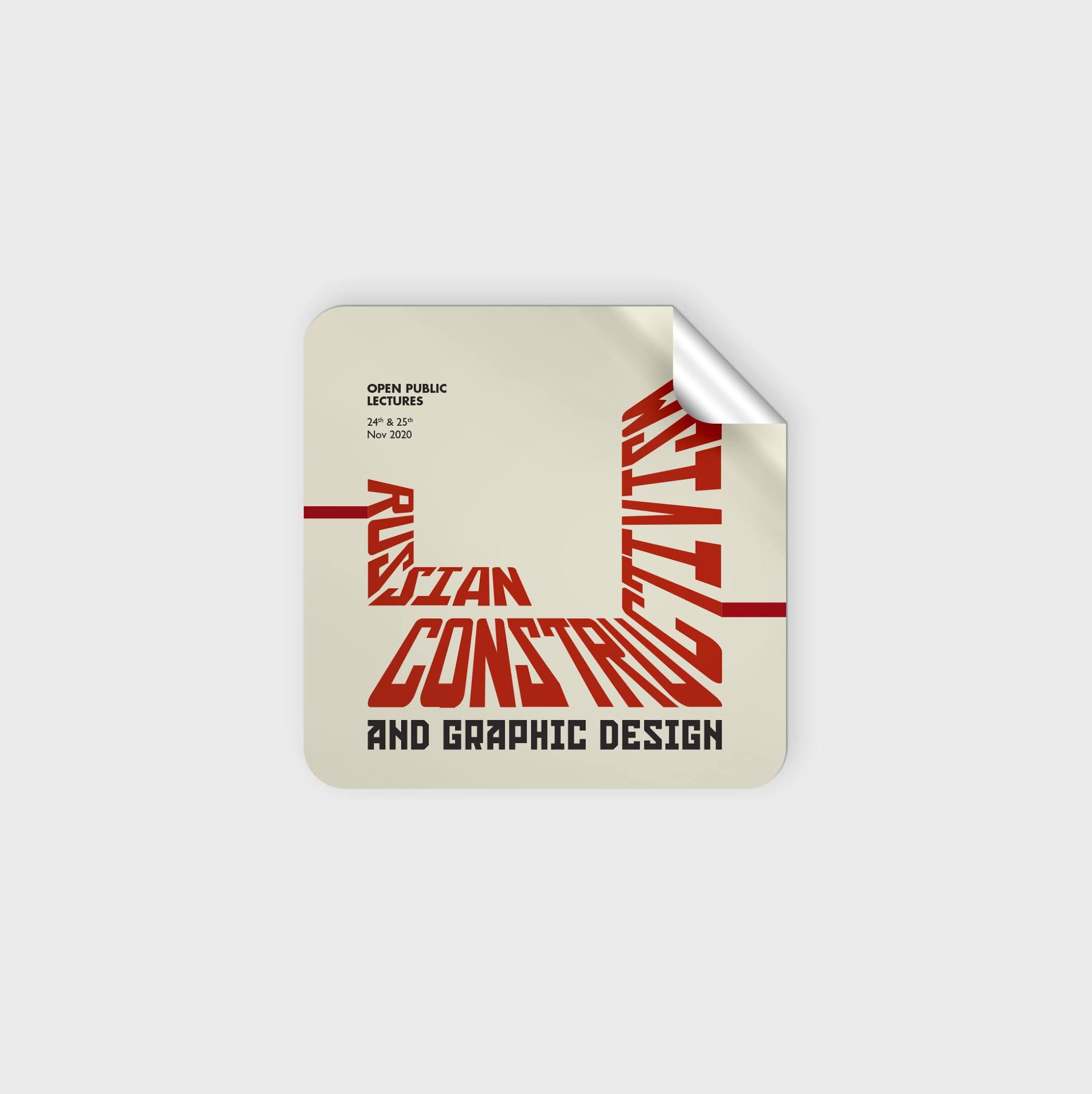
For the Part B, we were tasked with designing collaterals for the open public lecture of our choice, based on the Key Artwork we designed in Project 1A. We were to design a poster, an animated invite and couple of other collaterals of our choice.
I stared off with designing the poster as instructed. I first imported my Key Artwork and measured the line spacing and drew guides based on the key artwork. These guides worked as a grid for me to make placement of other elements easier.

While keeping the body text point size in mind, I placed the lecture details along the grid. Instead of placing the text in a regular horizontal manner, I decided to have it more in rhythm with the key artwork. I had to draw a few more guides to make sure everything was placed orderly.

Once all the textual details were placed, I decided to explore further on my idea of hallway for the key artwork. To develop the poster around the key artwork, I used a few rectangles over the edges to extend some of the letters. This gives a bit of a 3D effect to the design as well.

As a final touch, I decided to change the background color from white to eggshell/cream.

Although I was satisfied with the first design, I wanted to explore more on the constructivism style of posters. I started off with placing the key artwork on a 45o angle. I placed the details of the lecture also in the same angle. To highlight the key information, I made use of a few rectangles.

During my analysis of constructivism posters, one thing I noticed was the extensive use of lines. I wanted to incorporate this by using them on opposite corners of the page.

Before finishing up, I decided to add a shadow to the lover right side.

After consulting with Mr. Vinod, I chose Poster 01 as my final design. With the poster finalized, I moved on to design the interactive invite (evite).
Week 08 – 14/10/2020
For the animated invite, we were asked to
work on an artboard of 1000px x 1000px as it needs to be animated as well. Mr.
Vinod suggested that we use a minimum point size of 24pt for the body text as
it needs to be legible.
I placed my key artwork on the
artboard and started creating different variations of the invite.


As I liked the Design 04 the
most, I started to animate the invite. I wanted the body text to appear with a
wipe effect and for the key artwork to depict handwriting style. I mainly
relied on the stroke effect for the animation. I started by drawing the paths
for the stroke.


Next, I moved on to the remaining
collaterals. I decided to do mock-ups of things that will be included in the
welcome/gift bags at the lecture. So, I downloaded mock-ups of a bag, t-shirt,
sticker, pin, and given our situation right now, face mask.
I came up with different designs
incorporating the key artwork according to the collaterals.


Week 07 – 07/10/2020
General Feedback: Text size to be
between 8pt – 12pt. For the evite the text size should be minimum 24pt.
Specific Feedback: First artwork
is excellent. Can add an element to the empty space. Second design also
workable.
Week 08 – 14/10/2020
General Feedback: Poster layout
needs to be aligned and in line with the style of the key artwork. The key
artwork needs to be used imaginatively when designing collaterals rather than
slapping it on. Animate invite before proceeding with collaterals. The textual
information on the invite needs to be legible. The animation should represent
the mood/style or layout of the key artwork.
Specific Feedback: Animated
invite is fine but application of key artwork on collateral lacks imagination.
Week 09 – 21/10/2020
General Feedback:
Specific Feedback: Poster is
excellent. Mask is a good idea to have. Collateral needs to be a little bit
more exciting. Maybe good to have a fridge magnet. Try reversing the colors as
it will make a good variation. For the T-shirt use the lines. Same for the mask
and the bag as well. The animated invite is excellent work, very exciting to
look at.
Experience: Having a concept and knowledge
of the content that you want to design helps to speed up the process and it
reduced designers’ block.
Observations: Placing the textual
information on different axis makes the design more interesting instead of
having them simply groups in a regular manner.
Findings: When expanding a key
artwork on to a poster it is important to think of a grid or a system. This
helps in placing the different textual information in a more exciting way.
Week 08 – 14/10/2020
Experience: As we did not have a
live class, the progressions were posted on the Facebook group where Mr. Vinod
commented his feedback. It was easier in one way as we did not have to wait in
line to get feedback as we can just refer to the post later to check the
feedback.
Observation: A lot of students
did not consider the legibility of the textual information when designing the
animated invite.
Findings: Displaying all the information
on one slide is not necessary when creating an animated invite. The information
can be viewed on multiple slides.
Week 09 – 21/10/2020
Experience: I had a difficult
time attending class due to CMCO and lack of a WiFi connection at home. I was
able to get feedback for my designs but there was a definite barrier of communication.
Observation: One general comment Mr.
Vinod gave for almost every student is that the lack of imagination when
incorporating key artwork on to the collaterals.
Findings: I was able to
understand further on the purposes of collateral and how the key artwork can be
translated on to them depending on the collateral itself.
FURTHER READING
Week 07 – 07/10/2020
Typographic Design: Form &
Communication, by Rob Carter, Philip B. Meggs, Ben Day, Sandra Maxa, Mark
Sanders
Case Study – The U.S. National
Park Service Unigrid System (Page 176 – Page 178)

The United States National Park
Service (NPS) began developing the Unigrid system in 1976 as a design system to
unify the design of hundreds of site folders, while bringing harmony and
economy to its publications program. Having a standard format allows great
production economy. A carefully measured rows and columns creates modules and
spatial intervals that provide a structure for organizing type, illustrations,
photographs and maps in an orderly manner.
Due to its crisp, clean details
and legibility, Helvetica was chosen as the type family for their designs. In
order to create horizontal movement along the lines, the text was justified,
and columns were aligned top and bottom. Weight, posture and variations in the
leading were used to create contras between typographical and pictorial
elements.
The case study also mentions how
having a standardized format and typographic specifications enable designers to
focus on content and design rather than coming up with new formats and
specifications for every project.
Week 08 – 14/10/2020
Typographic Design: Form &
Communication, by Rob Carter, Philip B. Meggs, Ben Day, Sandra Maxa, Mark
Sanders
Case Study – Typographic Film
Titles (Page 183 – Page 185)

This case study looks at the
works of Richard Greenberg, a leading innovator in graphic design for film
titles, movie previews and television commercials. He believed that the film
titles set the tone for the movie. The first title dissected in the case study
is the Warner Brothers film Superman. It is explained how through the use of
specific colors, speed and movement, it evokes the powers of the fantasy superhero.
Another title looked into is the
Twentieth Century Fox production Alien. As the movie itself is of suspense and
mysteries, this is translated well into the title sequence. Small white
rectangle that appear transforms into the title forming the name of the movie.
For the movie True Lies, an elegant visual transformation of the two words
create tension as both the words have the opposite meaning. This a perfect fit
for the movie as it has incorporated the plot of the move.
What I understood from all these
examples is that it is possible to translate a full feature fil into a title
sequence through juxtaposition and careful planning. The case study made me go
back and see if this concept is applied for other movies as well. It was very
intriguing as at first glance one might not notice these details.
Week 09 – 21/10/2020
Typographic Design: Form &
Communication, by Rob Carter, Philip B. Meggs, Ben Day, Sandra Maxa, Mark
Sanders
Case Study – Typographic Film
Titles (Page 183 – Page 185)

This case study was very much
relevant to what we were tasked for Project 1A & 1B. It focuses on the
designs by John Malinoski for a street farmer’s market. Initially he designed a
poster for one of their events, which became a huge success that the simplistic
vector became the inspiration for the key artwork. This was a departure from
the usual photographic and engravings laden with obvious period typography.
The silhouette of the tractor
became the identity of the market. As a result, it was used on posters,
postcards, bumper stickers and various collaterals. It was because of the
striking simplicity and boldness that it attracted a lot of attention. We can
often see the tractor being incorporated to other images and typography in
relation to the farmer’s market.
This was one of the most
interesting examples of incorporating the key artwork into different
collaterals. It showed that it can be done in a simplistic manner without
bulking up on the key artwork.
Comments
Post a Comment