TYPOGRAPHY - PROJECT 2

Rifath Ali (0335738)
Typography
Project 2 - Font Design
LECTURE NOTES
Lecture 7: Basic / Describing Letterforms
During this week’s lecture we were briefed
about the basic terminology that comes into play when describing letterforms.
Ascender Height: The height of upward vertical stem on some lowercase letters that extends above the x-height is the ascender. The ascender must exceed the cap height as the capital letters tend to occupy space. So, to ensure that there is an optical balance the ascender is higher than cap height. It is also called equity.
Cap Height: The height of a capital letter
above the baseline for a particular typeface.
Median: The imaginary line defining the x-height
of letterforms.
X-height: The height in any typeface of the
lowercase ‘x’. When referring to the x height it also means an area.
Baseline: The imaginary line, the visual base
of letterforms.
Descender Height: The height of some lowercase
letters that extends or descends below the baseline.

Fig. 1.01: Labeled; Ascender height, Cap
height, Median, X-height, Baseline & Descender height
Stroke: Any
line that defines the basic letterform.

Fig. 1.02: Strokes
Apex/Vertex: The point created by joining two
diagonal stems. Apex are above and Vertex are below.

Fig. 1.03: Apex/Vertex
Arm: Short strokes off the stem of the
letterform, either horizontal or inclined upward.

Fig. 1.04: Arm; Horizontal & Inclined
Ascender: The portion of the stem of a
lowercase letterform that projects above the median.

Fig. 1.05: Ascender
Barb: The half-serif finish on some curved
strokes.
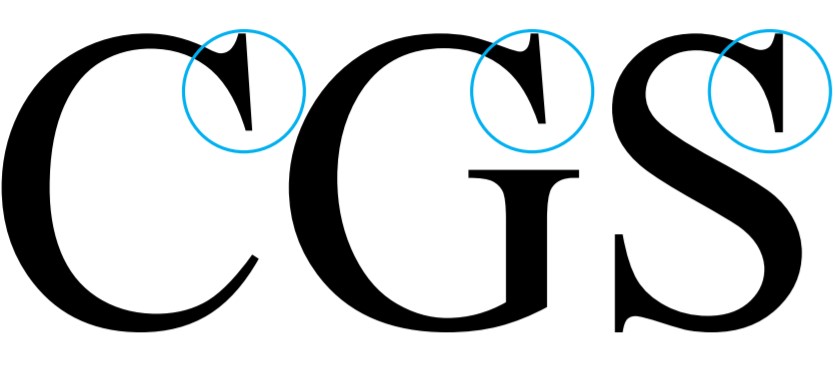
Fig. 1.06: Barb
Beak: The half-serif finish on some horizontal
arms. This is shorter than a barb.

Fig. 1.07: Beak
Bowl: The rounded form that describes a
counter. The bowl may be either open or closed.

Fig. 1.08: Bowl
Bracket: The transition between serif and the
stem.

Fig. 1.09: Bracket
Cross Bar: The horizontal stroke in a letterform
that joins two stems together.

Fig. 1.10: Cross Bar
Cross Stroke: The horizontal stroke in a
letterform that joins two stems together.

Fig. 1.11: Cross Stroke
Crotch: The interior space where two strokes
meet.

Fig. 1.12: Crotch
Descender: The portion of the stem of a
lowercase letterform that projects below the baseline.

Fig. 1.13: Descender
Ear: The stroke extending out from the main stem
or body of the letterform.

Fig. 1.14: Ear
Em/en: Originally refering to the width of an
uppercase M, and em is now the distance equal to the size of the typeface (an
em in 48 points, for example). An en is half the size of an em. Most often used
to describe em/en spaces and em/en dashes. There are 3 types of dashes; -hyphen
(break words, joining words), en (in replace of to), em space (sentence within
a sentence)

Fig. 1.15: Em & En
Finial: The rounded non-serif terminal to a
stroke

Fig. 1.16: Finial
Ligature: The character formed by the
combination of two or more letterforms.

Fig. 1.17: Ligature
Leg: Short stroke off the stem of the
letterform. It can be either at the bottom of the stroke or declined.

Fig. 1.18: Leg
Link: The stroke that connects the bowl and the
loop of a lowercase G.
Loop: In some typefaces, the bowl created in
the descender of the lowercase G.

Fig. 1.19: Link & Loop
Serif: The right-angled or oblique foot at the
end of the stroke.

Fig. 1.20: Serif
Shoulder: The curved stroke that is not part of
a bowl.
Spine: The curved stem of the S.

Fig. 1.21: Shoulder & Spine
Spur: The extension the articulates the
junction of the curved and rectilinear stroke.

Fig. 1.22: Spur
Stem: The significant vertical or oblique
stroke.

Fig. 1.23: Stem
Stress: The orientation of the letterform, indicated
by the thin stroke in sound forms. It can be vertical or diagonal.

Fig. 1.24: Stress
Swash: The flourish that extends the stroke of
the letterform.

Fig. 1.25: Swash
Tail: The curved diagonal stroke at the finish
of certain letterforms.

Fig. 1.26: Tail
Terminal: The self-contained finish of a stroke
without a serif.

Fig. 1.27: Terminal
The full font of a typeface contains numerals
and a few punctuation marks as well. Besides uppercase and lowercase, some
typefaces also includes small capitals. They are uppercase letterforms draw to
the x-height of the typeface.

Fig. 1.28: Small Caps
Although we normally see uppercase numerals,
some typefaces includes lowercase numerals. These are also known as nonaligned
figures. They are set to x-height with ascenders and descenders. They are best
used when using upper and lowercase letterforms.
Fig. 1.29: Lowercase Numerals
Lecture 8: Letters / Understanding Letterforms
16/10/2019 (Week 08)
In this lecture we were looking further into letterforms. As some uppercase letters perceive symmetry, sometimes it is not the case. There are unique arks in serif letters which creates a different serif for thinner and ticker stokes.

Fig. 1.30: Uppercase Serif Brackets & arcs
Although sanserif does not have brackets, they also have slight variations. Such as the width of the slopes differ from stoke to stoke. This maybe a minor effect but it could be a major change when in all the letters.

Fig. 1.31: Uppercase Sanserif Stroke Thickness
The image below (Fig.1.32) shows how complex an individual letterform can be although it may seem similar to the untrained eye. Upon further examination we see the details of the bowls of the letters and the stems.

Fig. 1.32: Comparison of Lowercase A; Helvetica vs Univers
Although the x-height normally describe the size of the lowercase letterforms, the curved letters always go below and above the baseline and the median. This way the curved letters appear to be the same size as the vertical and horizontal stoke they adjoin.

Fig. 1.33: Curved Letters on the Baseline & the Median
As some might say we don’t read letters we read patterns we need to study the negative spaces of the letters. How well we handle the counter when we set type determines how well words hang together. One of the ways to understand this is to study strokes by enlarging it.

Fig. 1.34: Negative Space/Counterfrom
Lecture 9: -Absent with approval-
23/10/2019 (Week 09)
INSTRUCTIONS
Project 2: Font Design; Briefing
09/10/2019 (Week 07)
For project 2, we were asked to design a limited number of alphabets based on one of the 9 typefaces we were given during the exercieses. We are to carefully study the font by analysing its anatomical parts. First, we sketch our ideas and digitize it and generate the font. The letters to be characters for this project are: d g i s n o e h t k r . ! ,
Week 7-8
To begin our project, we were asked to select
one of the nine typefaces we were given during Exercise 2. Then we were asked
to dissect the letters we were assigned for the project. I decided on Futura Bk
BT Book as my choice of typeface. I deconstructed the letters k, e, r and n.
During this process I got a better understanding of letter construction. I saw
the differences in thickness of the legs, arcs, and how the letter e goes out
of the baseline and the median.

Fig.2.01: Futura Bk BT Book; characters; d g I
s n o e h t k r . ! ,

Fig.2.02: Deconstruction of Characters k, e, r
& n
 Fig.2.03: Sketch 1
 Fig.2.04: Sketch 2
 Fig.2.05: Sketch 3

After the deconstruction, we were asked to
sketch out at least three typefaces we want to create based on the typeface we
chose. I did 3 sketches and showed to Mr. Vinod for approval. He liked sketch 2
and asked me to explore it.


Before I started the construction of the
characters, I set the descender, baseline, the median and the ascender. I began
with the letter d. I used the rectangle tool and eclipse tool to create the
basic form of the letter. I cropped out the areas where I needed it to be
detached. As I wanted to create a smooth curve at the top of the ascender, I used
a circle and cropped off the unwanted part. I used the same angle for the
remaining letters as well in order to maintain consistency. I used the same
approach when constructing the letter g.

Fig.2.06: Character Construction; Letter d
& g; Using rectangle and eclipse tool
Next, I started on the letter s. I used pen tool to create a stroke in the shape of the letter. Then I created a path from the stroke and cropped from the middle of the spine. I used the same circles as before to create smooth round edges.


Next, I started on the letter s. I used pen tool to create a stroke in the shape of the letter. Then I created a path from the stroke and cropped from the middle of the spine. I used the same circles as before to create smooth round edges.

Fig.2.07: Character Construction; Letter s; Using
pen tool and eclipse tool
I mainly used the eclipse tool and the rectangle
tool to construct the letters o and e. While dissecting the letters earlier, I did
realize that the letter e is not proportionately round. So, I kept it in mind when
I constructed the letters.

Fig.2.08: Character Construction; Letter o
& e; Using eclipse and rectangle tool
To construct the letters i, t and K, I mainly
used the rectangle tool. This is because these letters consist of vertical
stroke/stem and legs. I curved the edges of the rectangle to the same size as
previous characters.

Fig.2.09: Character Construction; Letter i, t &
k; Using rectangles and eclipse tool
After that, I started working on the letter r. This
time also I used the same tools as before. Although I did face some
difficulties in creating the right ear. I used the eclipse tool mainly and also
the pen tool to construct the ear of the r.

Fig.2.10: Character Construction; Letter r; Using
eclipse and rectangle tool
For the letters n and h, the main difference is
in the length of the stem as the stem of letter h touches the ascender. I
mainly used rectangle and eclipse tool to create the letters. But I also used
pen tool to fill and make some of the edges smoother.

Fig.2.11: Character Construction; Letter n
& h; Using eclipse, rectangle and pen tool
I created the remaining characters using the
same tools and methods as before.

Fig.2.12: Character Construction; Special
Characters;


Fig.2.13: Initial Font


Week 8-9
After digitizing all the characters, we were asked
to merge all paths into one path and import the characters to FontLab. First,
to create a new file we went to font info; metrics and dimensions and key in
the dimensions for the ascender, median, baseline and the descender. We were
instructed to calculate the measurements from the base line.

Fig.2.14: Create New FontLab File; Set Font Dimensions

Fig.2.15: Character Imported to FontLab; Letter
d
Once all the characters were imported, I moved
on to adjust the kerning as instructed. I selected all the characters and clicked
to new metrics window. There I set 50 as a default spacing for all the characters.
Then I did specific adjustments for certain letter.

Fig.2.16: FontLab, New Metrics Tab; Kerning
Characters
Before I proceeded to export the font, I asked
for feedback from Mr. Vinod. He pointed out to give letter spacing on the left
and right bearing of the letter i. And kerning after the letter r on the right
bearing. He also advised to improve the stress on letters n and h. He suggested
I refer to Futura and see how the letter curves up. Aslo, he asked to reduce the spacing between the words.
After receiving the feedback, I decided to
reconstruct the letters n and h. I studied the stress and curves of the letters
in Futura a bit more. I gave the shoulder a bit more curvature and lowered the
left edge. I brought the same adjustments to the letter h.

Fig.2.17: Character Re-construction; Letter n;
Using eclipse tool, rectangle tool and pen tool. Referencing to letter n of Futura
Fig.2.18: Adjusted Letters n & h


I brought the changes advised by Mr. Vinod and
some more adjustments to the characters before exporting the font.

Fig.2.19: FontLab, New Metrics Tab; Finalized
Kerning

Fig.2.20: Final Font
Fig.2.21: Final Font; PDF


Next, I proceeded to export the font I created.
I decided to name it Detach as parts of the characters are disconnected.

Fig.2.22: Export Font; Detach.ttf

Fig.2.23: Detach.ttf; Installed


After generating the font, we were asked to
create a poster with the phrase “god is in the kerning” as the final task for the project.

Fig.2.24: Poster Process

Fig.2.25: Poster; Final Result
Fig.2.26: Poster PDF; Final Result
FEEDBACK
Week 7
General Feedback: On the e-portfolio PDF is for
final submission only, to show the process of our work, JPG file is enough. We
are to create only one label for typography. Mr. Vinod advised us to stay away
from playful typefaces when we come up with our designs for the typeface. It
needs to be relatively serious. The trick in designing typeface is where to
introduce a small style.
Specific Feedback: Mr. Vinod pointed out to me
to explain the idea of the expression briefly in the caption on my e-portfolio.
Week 8
General
Feedback: Continuously update the e-portfolio.
Specific
Feedback: Mr. Vinod and Mr. Shamsul mentioned that the digitization is working
out well. The curve on top could be more which will make it more like a tear
drop instead of a sudden curve. The dot in the lowercase I is contrastingly
larger compared to the letter itself. The contrast in the thickness need to be
reduced as the dot got sharp edges on the sides.
Week 9
General
Feedback: -Absent with approval-
Specific
Feedback: I sent over my digitized
letters to Mr. Vinod via FB and he responded saying it seems good. He then
asked to combine the paths and transfer them to FontLab, kern pairs, and then
generate the font. Later on I shared the FontLab file regarding kerning and
spacing. He pointed out to give letter spacing on the left and right bearing of
the letter i. And kerning after the letter r on the right bearing. He also advised
to improve the stress on letters n and h. He suggested I refer to Futura and see
how the letter curves up. He also mentioned that the word spacing is too much asked
to reduce it a bit.
REFLECTIONS
Experiences: When I started the project with the dissection, I learned how characters are constructed. I knew how to create certain arcs and angles after that, and it helped with the rest of the project. I learned more when I started constructing the personalized characters and it got easier as I got more letters done. FontLab was a whole new experience for me and now I have gained the basic knowledge of how to generate a typeface.
FURTHER READINGS
Grid Systems in Graphic Design by Josef Müller-Brockmann

 Fig. 5.02: Lettering & Type: Creating
Letters & Designing Typefaces
Fig. 5.02: Lettering & Type: Creating
Letters & Designing Typefaces
by Bruce Willen & Nolen Strails
Experiences: When I started the project with the dissection, I learned how characters are constructed. I knew how to create certain arcs and angles after that, and it helped with the rest of the project. I learned more when I started constructing the personalized characters and it got easier as I got more letters done. FontLab was a whole new experience for me and now I have gained the basic knowledge of how to generate a typeface.
Observations: One thing I observed when dissecting
was that not all stokes are same in thickness and not all arcs and bowls are in
proportion. I also observed how round letters go beyond the median and descender.
I observed how a minor angle of the stem or stroke can throw off the whole
sentence off balance. This made me redo certain characters along the way.
Findings: Without prior understanding of how typefaces
are created, I found it challenging at first. Some of the strokes and arcs were
not in the same proportion and it bothered me. However as I went deeper into
it, I found out how small details matter when designing a typeface.
Grid Systems in Graphic Design by Josef Müller-Brockmann
09/10/2019 – 16/10/2019 (Week 7 - Week 8)

Fig. 5.01: Grid Systems in Graphic Design by
Josef Müller-Brockmann
This book focuses on handling visual problems
and how to solve them in terms of conception, organization and how to design
them with greater speed and confidence. It also talks about how to familiarize
with the essentials of the grid and on ways of producing it and how to utilize
it.
Although this book focuses on the grid system, I
was able to gain some insights about font design. It contained details of
different characteristics of letterforms. This allowed me to find out more
details about the topics we discussed in class. The book also highlighted on
how studying the classic typefaces can be helpful to designers. As this allows us
to understand what the timeless criteria are which produce a refined and
artistic typeface that makes reading easy.
Lettering & Type: Creating Letters &
Designing Typefaces
by Bruce Willen & Nolen Strails
16/10/2019 – 23/10/2019 (Week 8 – Week 9)

by Bruce Willen & Nolen Strails
As the title suggests, this book was focused
around designing typefaces. The book starts off with an explanation of how
typefaces evoke wide range of emotions and the importance of legibility. The authors
also mentions how typographic systems change according to new challenges faced.
They also highlighted on the importance of finding a balance between the aspiration
and practicalities of the designs.
Further into the book, it discusses the
typographic systems and how they are connected to one another. These systems show
how typography evolved over time. They are, writing, lettering and type. Within
this chapter I came across some new typographic terminologies in letter
structure; Taper, Bracketed & Unbracketed Serif, Reflexive & Transitive
Serif, Bilateral & Unilateral Serif to name a few. This was followed by an
explanation of Book Typefaces and Display Typefaces. Book typeface was
developed for large bodies of text and display typefaces are commonly used for
posters, signs, web banners and such.
The most intriguing part in this book for me
was Chapter 3: Creating Letters. This chapter proved to be very relevant to the
assignment 2. It notes that designers need to have a clear perception of the
concept before we even begin to sketch our ideas. This will result in a more
precise and powerful outcome. It was also mentioned that lettering and typeface
design takes time. It is a slow and meticulous process. First, we are to sketch
on paper and then perfect and render it digitally. Sometimes it takes multiple
sketches before we digitize it. This process will allow us to identify flaws in
our design.
Comments
Post a Comment