ADVANCED TYPOGRAPHY - PROJECT 02 (FINAL)

LECTURE NOTES
Project 02: Exploration & Application
Week 10 – 28/10/2020
For our final project, we had to develop a font that is intended to solve a larger problem or be part of a solution in the area of our interest. At first, I had trouble coming up with a concept but later on remembered a project that I was working on before and how designing a typeface could be part of it. A client had asked me to design a brand portfolio for a vape shop with the theme of pirates. However, I was unable to find a typeface that was san-serif and looks modern enough. Most of the existing typefaces are either too playful or does not represent the theme to my liking.
After I consulted with Mr. Vinod, he suggested that I do a bit of research on the movie franchise “Pirates of the Caribbean” and look at the graphical elements used in their scenes. So, I created a mood board with some existing typefaces I found and further references from the movies.
Fig. 1.01: Exploration: Mood Board (PDF)
Week 11 – 04/11/2020
I started off with designing the
letters using pen tool and creating strokes. First, I designed few characters
to get an idea about how thick the strokes should be and the shape of. Later on,
I constructed the 26 characters.


While adjusting the strokes I notice
an interesting look in the letter N with the sharp edges going beyond the cap height
and baseline. I decided to incorporate it into rest of the character design as
it represents sharpness in some ways.

To give further detailing to the
letter, I decided to try and show cracked wood. But, once I was done, it looked
more like cactus than cracked wood.

Week 12 – 11/11/2020
After my consultation, I was
given the feedback to add the sharp corner to the cap height as well. While
doing it I decided to reduce the size of it.

As I did not like the cracks I used
before, I gave it another try.

Once I was done with the characters,
I move on to develop the numbers. I followed the same steps as before.


During this week’s feedback, Mr.
Vinod Suggested to move the end stroke of the letter Q lover as it was too
close to the body.
Week 13 – 18/11/2020
Next, I proceeded to prepare the
typeface to be generated on FontLab. I placed all the characters on a standard baseline
and placed them accordingly.

I Imported all the characters to FontLab
and made adjustments to the letter spacing. At first I had trouble adjusting
the kerning. After a few tryouts I was able to make the adjustments as I wanted.


Once I was happy with the
results, I exported the typeface as an Open Type – TT.
Before I proceeded with the collateral,
I designed a simple logo using the typeface and an artwork I downloaded. I did
not use too much graphical elements as I wanted to show the application of the typeface
I designed.

Once the logo was ready, I
started designing the remaining collaterals.


I decided to use Futura Std Lite as
the secondary typeface for the collaterals. I kept the graphic elements to a
minimal to focus more on the typeface.
Below are the initial mock-ups I’ve
created.


During this week’s feedback
session, Mr. Vinod pointed out that the poster lacks context and power. Also,
that I need to make sure people know what is being sold. To achieve this, he
suggested to show the incorporation of the typeface with the product more
rather than with just the packaging. Generally, he suggested that I lean on the
collateral a bit stronger.
While following Mr. Vinod’s
feedback, I made changes to the packaging layouts and created a product label
as well.

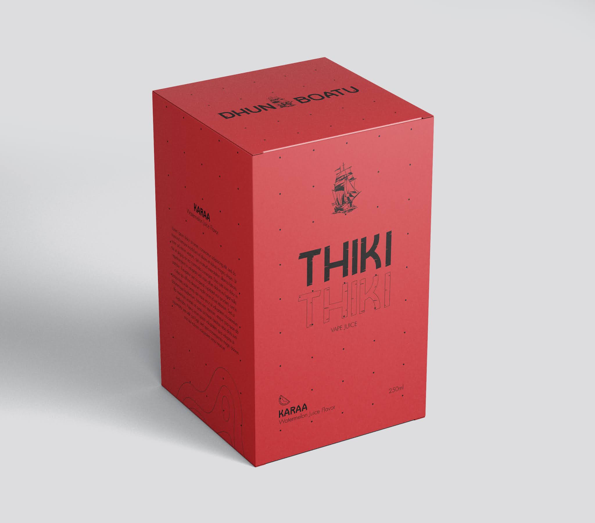
To show the product more, I
created another mock-up of the vape flavour bottles with the packaging.

Once I was satisfied with the
designs, I finalized all my artwork for this project.
Final
Submissions for Project 02 (Final)

Fig. 1.23: Complete Set of Characters from the Typeface Designed; Dhun Boatu (PDF)


Fig. 1.31: Compilation of Collaterals (PDF)
Week 10 – 28/10/2020
General Feedback: Make sure we
find a solid problem that needs fixing and do research on the chosen problem.
Specific Feedback: Concept is
workable. Research on the elements that can be seen from the “Pirates of the
Caribbean” franchise. Can look into skulls and bones. Try to mimic traditional
yet keep it modern. Looking into semi serif typefaces could help get things
started. Details are everything. Focus on details.
Week 11 – 04/11/2020
General Feedback: E-portfolio
files are not visible in some blogs. Incomplete or no posts on some exercise.
Some e-portfolios look it is done in a hurry, need to pay attention to details.
Specific Feedback: Letters M
& N looked interesting. Maintain the sharp angle that is at the cap height
on the base line as well for all the letters. It will give a formal yet very
casual look. Have a diagonal rule so that it is consistent through out the
typeface.
Week 12 – 11/11/2020
General Feedback: Start thinking
about how the application of the typeface and collateral designs. Make sure the
thickness of the strokes are consistent.
Specific Feedback: Give a bit
more distance between the Q’s tail and the stroke. When it stays too close to
each other it is not very legible. Proceed with typeface generation and
collateral design.
Week 13 – 18/11/2020
General Feedback: Finish
e-portfolio and make sure everything is updated. All posts need to be completed
by week 14.
Specific Feedback: The poster
lacks context and power. Need to make sure people know what is being sold. Show
the incorporation of the typeface with the product more. Lean on the collateral
a bit stronger.
Week 10 – 28/10/2020
Experience: For the final
project, I had trouble coming up with a strong problem that needs a solution. When
I saw a problem with a typeface, I understood that the problem is maybe just
because I don’t find the typeface appealing and that was not a solid enough
problem to base the entire project on.
Observations: Many of the classmates
were doing dual-lingual typefaces. It was one of the options I had in mind as
well, but after seeing the number of students working on a similar aspect, I decided
to go in a different direction.
Findings: Sometimes, the right
ideas are right in front of us. My choice of theme for the final project came
from a client’s request, which I had not been able to commit to. I was thinking
too hard to find a problem to solve while I myself had a problem that needed a
solution. The realization made the process a lot easier.
Week 11 – 04/11/2020
Experience: This week was mainly
a refreshment of the typeface design project from the last year. I was able to
follow the same process as before with the use of paths and strokes. I went
back and referred to previous notes and made me appreciate having the notes
readily available.
Observation: When adding the details
for the characters, I observed the importance of paying attention to details.
As initially I added the details in a random manner, I was not satisfied the
result I got. The chaotic look was not what I was trying to achieve with the
typeface design, so I had to reconsider the details.
Findings: One thing I found out
was that an imperfection in one character could add value to the entire
typeface. Initially the sharp angle on the letter N & M were removed as I felt
it did not fit in well with the typeface. However, once I added similar sharp angles to
all the characters, it gave the whole typeface a new look and improved the
design.
Week 12 – 11/11/2020
Experience: I enjoyed designing
the numbers. I think the experience from designing the characters made it easier
working with numbers.
Observation: I went and took a closer
look at how numbers were designed for different typefaces. I was able to see
small details that I did not notice before.
Findings: When designing numbers
and punctuations, I found it tricky when proportioning different parts of it.
Especially with the comma, I had to carefully place it on the baseline and look
at the angle and distance of the curves.
Week 13 – 18/11/2020
Experience: I will never underestimate
the power of kerning ever again. I had trouble with the concept of letter
spacing and kerning before. But, after this project I believe I have gained a
much better experience when generating the typeface and hence, understand
kerning better.
Observation: I was able to see how
characters behave when placed next to another character. The overlapping space
and kerning were an interesting process. I also observed that there is a need
for kerning in characters that I did not expect would require it.
Findings: While designing the
collaterals, at first, I faced a challenge as the product I was working with
was not entirely ethical. I tried to design the collaterals in a very discreet
manner. At the same time, I found my approach could actually be beneficial to
the client as it made the product more appealing with the use of bright colors,
instead of the regular dark and dim colors.
FURTHER READING
Week 10 – 28/10/2020
Typographic Design: Form & Communication, by Rob Carter, Philip B. Meggs, Ben Day, Sandra Maxa, Mark Sanders
Typographic Design Process – A
Traditional Model (Page 221 – Page 222)

The chapter opens with an insight
on how different designers proceed with their problem solving. It is understood
that there is no single process or method that every designer must follow. One
of the well-known models in design process consists of five stages. Although, these
five stages are not leaner, rather it is an incorporation of each stage whenever
the need for it arises.

At the Defining phase, it is
important to understand the client’s needs and the intent and application of
the solution they seek. Careful consideration needs to be made regarding their
goals, objectives, audience, budget, and potential limitations. When it comes
to Gathering phase, essential information regarding all aspects of the problem
need to be collected through whatever possible means. It widely depends on the
problem and the scope of the needed solution. Therefore, it is important to
make use of any and all available resources.
I found these two components of
the design process very valuable as it was very relevant to my Final Project.
As I had decided to design a typeface for a client, I followed the mentioned
phases. I started off by listing down the requirements given by the client and
moved on to research on what I could incorporate into my typeface design.
Week 11 – 04/11/2020
Typographic Design: Form & Communication, by Rob Carter, Philip B. Meggs, Ben Day, Sandra Maxa, Mark Sanders
Typographic Design Process – A
Traditional Model (Page 222 – Page 224)

The next phase in design process
is Ideating. During this phase, the most important thing is to have an open
mind and trying to think from different perspectives. Having a sense of experiment
and going off on new and unexplored approaches could lead to limitless
potentials. However, some experienced designers are known to follow a knowledge-based
intuition. Meanwhile, this approach is safer for problem solving, it could
limit the potentials for new possibilities.
Synthesizing or simply explained
as test runs, are a way to measure how much of the problem is solved and what
are the areas that still need to be improved and changed. The best way to
evaluate how effective the developed solution is to go point by point against
the criteria established at the beginning of the design process. This will ensure
that all the needed areas are addressed and completed.
A designed solution has no place
without the client’s approval. Therefore, it is always important to ensure
effective communication with the client and designer to prevent confusion and
misunderstanding. As clients do not think like designers, it is important to
educate them in a simple way on the solutions designed and how it benefits the
client. This will help to build mutual trust and respect between client and
designer.
I saw this as an area that I need to work on as a designer. Thinking from different angles have always been a challenge for me. As a result, my design process takes a lot more time than it should. Moreover, sometimes I find myself working on a design without getting feedback on the designs throughout the process until the very end. As a result, the product turns out different from what the client had expected and results in having to redo majority of the work. Moving forward, I would ensure proper communication with the client as a way of building loyalty.
Week 12 – 11/11/2020
Typographic Design: Form & Communication, by Rob Carter, Philip B. Meggs, Ben Day, Sandra Maxa, Mark Sanders
Processing Typographic Form and
Idea (Page 223 – Page 225)

There are several techniques that
aid designers in processing typographic form and ideas. The main objective of
typographic problem solving is to develop ideas baes on form and meaning. One
of the most well-known way of doing this is through sketchbooks and process books.
They can be either physical sketchbooks or digital. This process can also be
done through photographs, drawings, writing and collecting thoughts. Therefore,
a sketchbook becomes a rich collection of things observed and raw thoughts. As
you update the sketchbook, it reflects the designer’s mental flights, observances,
and voices. In the meantime, a process book records specific processes as they
unfold. Having a process book helps in understanding the progression and see
how much close to a solution you are.
Brainstorming and mind mapping are
also well-known tools that can be used throughout the typographic process. Brainstorming
sessions which are free from judgement allows greater idea generation in a
group dynamic. Mind mapping is nonlinear brainstorming process with one central
point of focus. This helps designers to identify potential content.
Another interesting concept
discussed in this chapter was the use of word lists and interaction matric structures.
It is said that this helps open the designer’s mind to broader areas and unexpected
visual possibilities. As sometimes things that seem far too distinctive might
just be the right combination to create something extraordinary.
Understanding these techniques made
the process of idea generation much more convenient. As the scope of designers
grow wider and wider, I sometimes find it hard to come up with original ideas. This
was the first time I read about the matrix structure and I am intrigued to make
use of it in the future.
Week 13 – 18/11/2020
Typographic Design: Form &
Communication, by Rob Carter, Philip B. Meggs, Ben Day, Sandra Maxa, Mark
Sanders
Processing Typographic Form and
Idea (Page 224 – Page 227)

One problem often faced by a lot of us being
unable to visually express an idea we have. As a result, the effectiveness of
the idea cannot be fully evaluated. Some explain that the design process begins
at the base of a pyramid with limitless options. But as we move upwards to the
tip of it, the vision of a viable solution becomes more specific. Metaphorical
thinking plays a role in typography as letterforms can suggest objects and
ideas beyond their function. These can occur through careful manipulations, positions,
rhythmic sequence and color. This process focuses on finding relationships
between dissimilar ideas and objects.
Due to the rapid technological
developments, a lot of designers heavily rely on computers. Although
traditionally we sketch out on paper and then digitize it, some designers prefer
to start directly with a digital version. There is no right and wrong of doing
this as long as the process delivers and effective and creative solution. When
working digitally, it is important to save the progression of your work as you
go. This will provide a good source for future referencing and understanding of
the process of the work.
This was a technique I have been following for some time now. Mainly due to the fact that we need to record the process of our work for the e-portfolio. Like it was mentioned in the book, I find it easy to go back and see through my process to understand what I was trying to achieve. This approach has proven useful to me multiple times.
Comments
Post a Comment